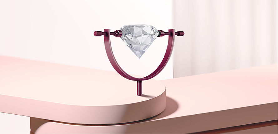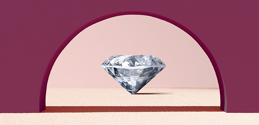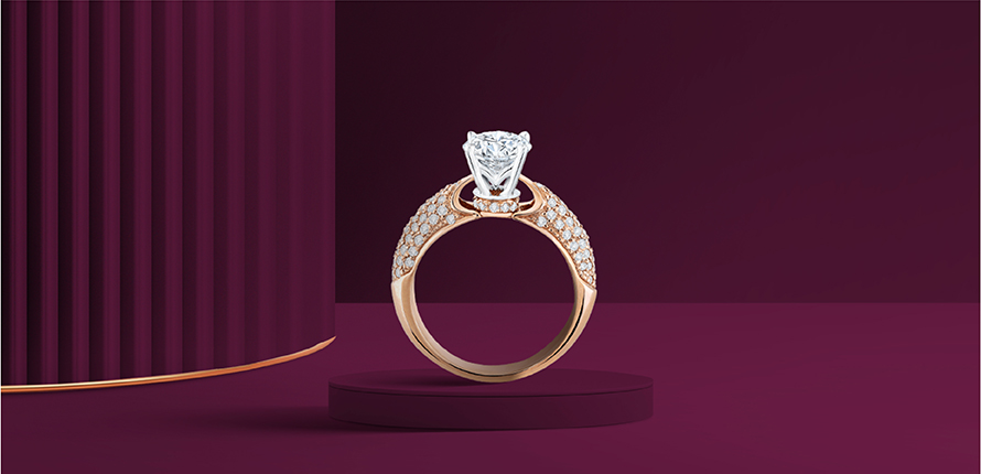
We chose paper and diamond as contrasting visuals to reflect Frank & Co.’s craftsmanship. Paper represents fluidity and movement, while diamond symbolizes precision and permanence. Through meticulous design, Frank & Co. makes the diamond feel as dynamic as paper—highlighting the brand’s ability to blend technical mastery with artistic expression.
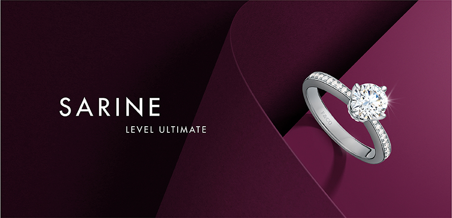
Choosing the Futura typeface strikes the right balance for Frank & Co.’s audience. It feels modern and youthful—perfect for the 20 to 40 age group—while still carrying the refined, premium feel the brand is known for.