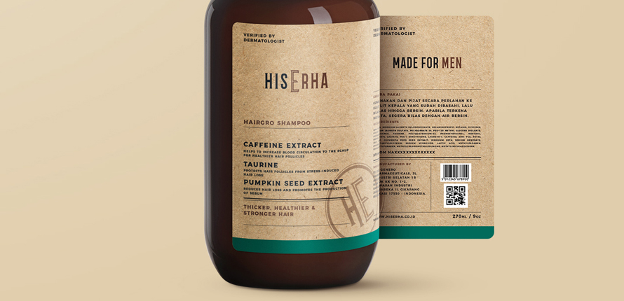
The name comes from the insight: self-care for men. If you are confident in yourself, you will stand out from the rest.
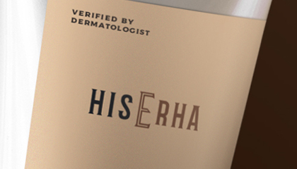
The letter “E” is designed to be larger than the others to capture this idea. The typeface and color are designed to appear both masculine and indie at the same time.
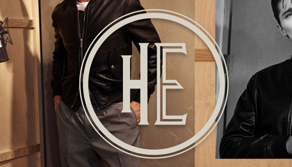
The brand also has a logo emblem, which is created with the abbreviation of His Erha. The letters H and E are read as “HE” to represent the brand more clearly.