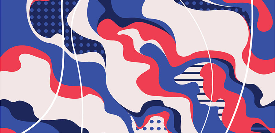
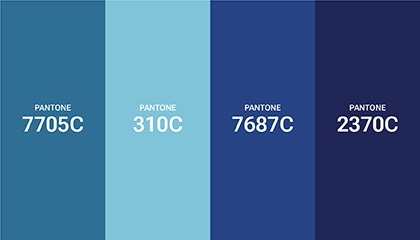
During the Witch Hazel Series’ development, the brand structure and color codes evolved. All final patterns use shades of blue, reflecting Erha AcneACT’s brand color.
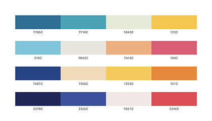
As we explored various combinations of complementary colors, we found one that aligns with the existing Witch Hazel Series palette while still being distinct enough to signal a different product variant.

The swirling, circular cluster shapes are inspired by the rubbing motion used when applying the pads, as well as the clean, soothing sensation they leave on the skin. The circular lines represent the shape of the pad, while the dotted pattern—consistent with the established Witch Hazel Series—symbolizes the product’s acne-care function.
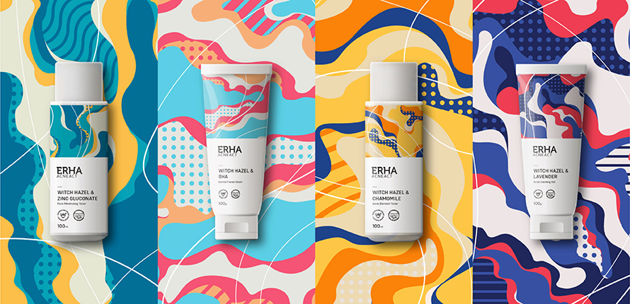
Since these new products are part of the AcneACT series, we believe it’s important to maintain consistency with the existing design. That’s why we kept the split template and retained the color blue (the primary color of Erha AcneACT), ensuring visual harmony across the entire series.

