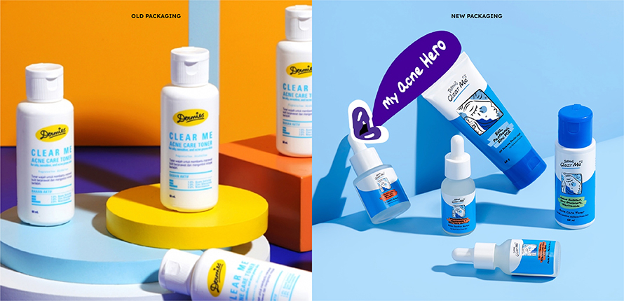
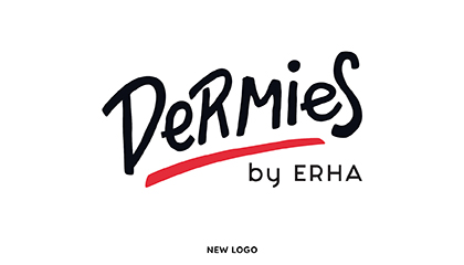
Uppercase and lowercase handwriting fonts are used to evoke a sense of playfulness while reflecting the varied tones of expression used by our target audience. The stroke weight is kept bold, with a strong underline to emphasize the statement: “This is who we are.”
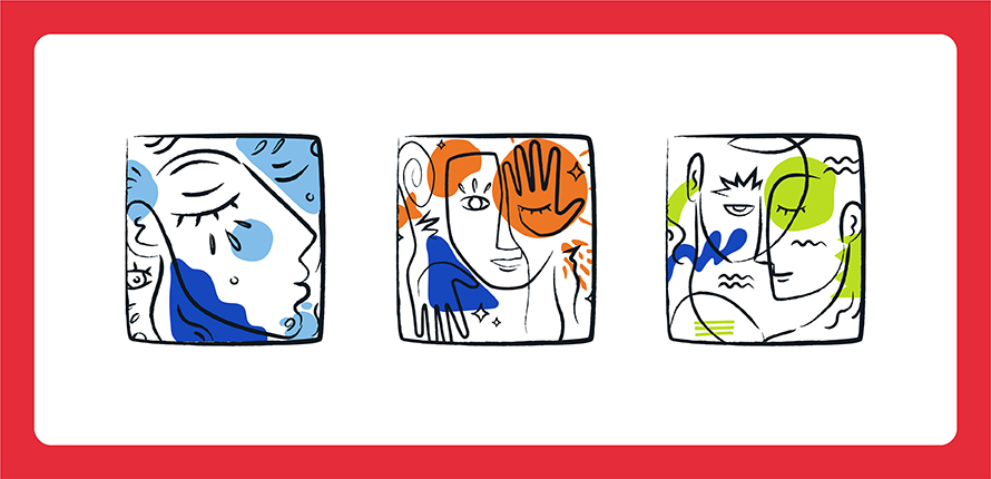
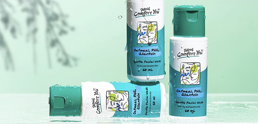
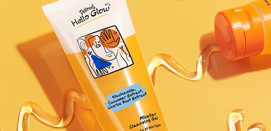
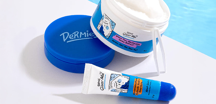
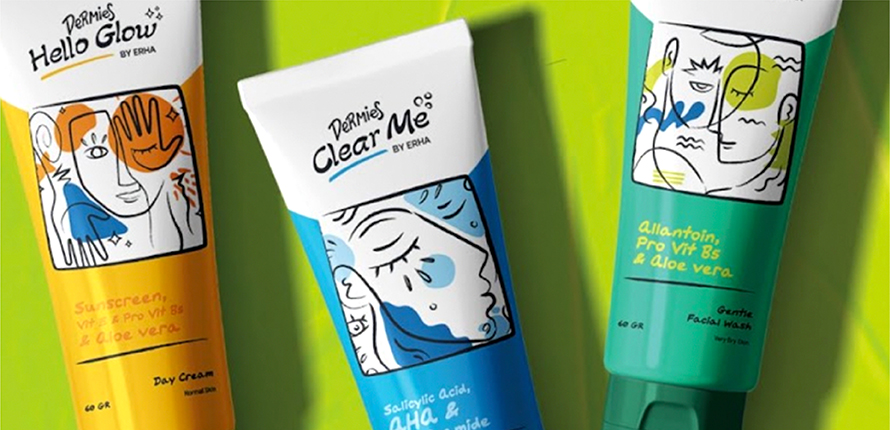
To give the packaging a fresher and more youthful look, we introduced illustrations—something the previous design didn’t include. Inspired by abstract cubism, the illustrations use lines, colors, and shapes to capture expressions of youth that are fun and bold.